API Unterschied
Contents
3.6. API Unterschied#
Es gibt zwei verschiedene Ansätze
3.6.1. pyplot-API (state-based)#
Einsteigerfreundliche Weg und chronologisches Aufrufen der Befehle was eher an MATLAB oder Mathematica erinnert
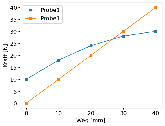
import numpy as np
import matplotlib.pyplot as plt

x = np.array([0,10,20,30,40])
y1 = np.array([10,18,24,28,30])
y2 = np.array([0,10,20,30,40])

plt.plot(x,y1,marker="s",label="Probe1");
plt.plot(x,y2,marker="s",label="Probe1");
plt.legend()
plt.xlabel("Weg [mm]");
plt.ylabel("Kraft [N]");
3.6.2. object-oriented API#
Definition eines Figures (fig) (Das Bild was angezeigt bzw. gespeichert werden kann). Innerhalb des Figures werden Axes (ax) definiert. Ein Figure kann mehrere Axes beinhalten. Axes ist nur ein Name für die Plots die innerhalb des Figures erstellt werden (hat nichts mit den Achsen zu tun).
fig, ax = plt.subplots()hinzufügen
ax ersetzt plt (bei title/label mit + set_ )
plt.plot()->ax.plot()plt.xlabel()->ax.set_xlabel()plt.ylabel()->ax.set_ylabel()plt.title()->ax.set_title()
import numpy as np
import matplotlib.pyplot as plt

x = np.array([0,10,20,30,40])
y1 = np.array([10,18,24,28,30])
y2 = np.array([0,10,20,30,40])

fig, ax = plt.subplots()

ax.plot(x,y1,marker="s",label="Probe1");
ax.plot(x,y2,marker="s",label="Probe1");
ax.legend()
ax.set_xlabel("Weg [mm]");
ax.set_ylabel("Kraft [N]");

3.6.3. Aufgabe#
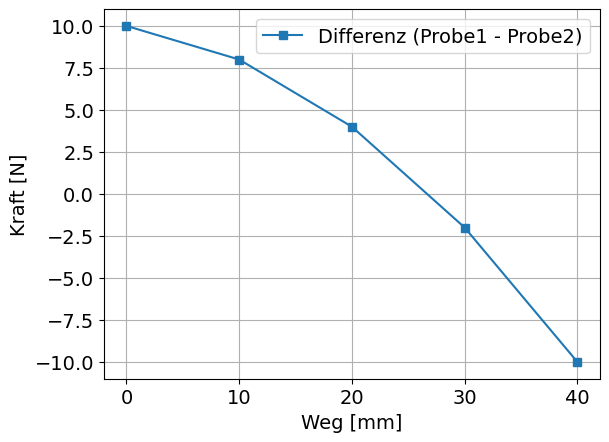
wandeln Sie folgenden Code in den object-orientierten Ansatz um
import numpy as np
import matplotlib.pyplot as plt

plt.plot(x,y1-y2,marker="s",label="Differenz (Probe1 - Probe2)");
plt.legend()
plt.xlabel("Weg [mm]");
plt.ylabel("Kraft [N]");
plt.grid()
plt.savefig('Uebung2_Differenz.png', bbox_inches='tight', dpi=100)
wandeln Sie folgenden Code in den object-orientierten Ansatz um
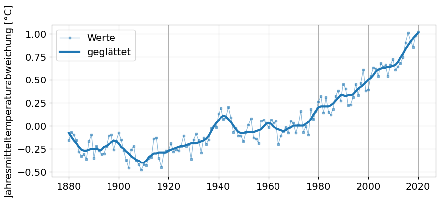
import pandas as pd
import matplotlib.pyplot as plt

link = "https://data.giss.nasa.gov/gistemp/graphs_v4/graph_data/Global_Mean_Estimates_based_on_Land_and_Ocean_Data/graph.csv"
Temp_NASA = pd.read_csv(link, header=1) # einlesen

plt.style.use('default')
plt.figure(figsize=(10,4))
plt.rcParams['font.size'] = 14;
plt.ylabel("Jahresmitteltemperaturabweichung [°C]")
plt.plot(Temp_NASA["Year"],Temp_NASA["No_Smoothing"], ls="-", lw=1, marker="s", ms=3, color="tab:blue", alpha=0.5, label="Werte");
plt.plot(Temp_NASA["Year"],Temp_NASA["Lowess(5)"], lw=3,  color="tab:blue", label="geglättet");
plt.legend();
plt.grid();